Picture this. In the foreground, by a thatched farmhouse, a beautiful woman holds by the claws the chicken she’s just slaughtered, her white apron stained with blood. She talks, perhaps flirts, with an equally gorgeous hunter in leather, a hawk on his gloved arm. Behind them loom the picturesque ruins of a Welsh castle, gray clouds throwing it all into high relief. I once came upon this scene while on vacation, and it would have made for a memorable photograph, the image preserved within the confines of a four-by-six-inch print. But instead of fumbling around for a camera, I continued instead to gaze at the scene before me, which, in all its expansive, seemingly limitless glory, became burned into my frontal cortex. For that I am forever grateful.
Artists have always faced this issue: the world is immense, so what slice can evoke the whole cake? How to summon the gestalt of passing clouds, birdsong, the smell of the chicken’s fresh blood? How are we to frame our experience, to fence that particular field? The animals painted on the walls of the Lascaux Cave in southwestern France cavort in free-range fashion on undulating rock; their descendants take the form of graffiti, spray-painted on subway cars around the world. But art generally tends to confine itself, and for artists, limitation and freedom, prohibition and potential, are locked at the hip. In choosing the format for their work—whether it be a canvas, a subway car, a rock face, or a wall—they court implicit meaning and metaphor.
The frame’s orientation also influences the way we see what’s depicted within. A horizontal rectangle might suggest a landscape vista or, like a Chinese scroll, movement through time, where the past becomes occluded, the present visible, and our future viewable only through unrolling. (The rectangular format of TV and movie screens, for example, was chosen for a reason.) But when all sides of the rectangle can be seen at one time, we intuitively become conscious of the frame, comparing length with height, and we begin to subdivide the space into sections, creating boundaries—without which our minds and eyes might wander, like the animals of Lascaux, nibbling on this and that.
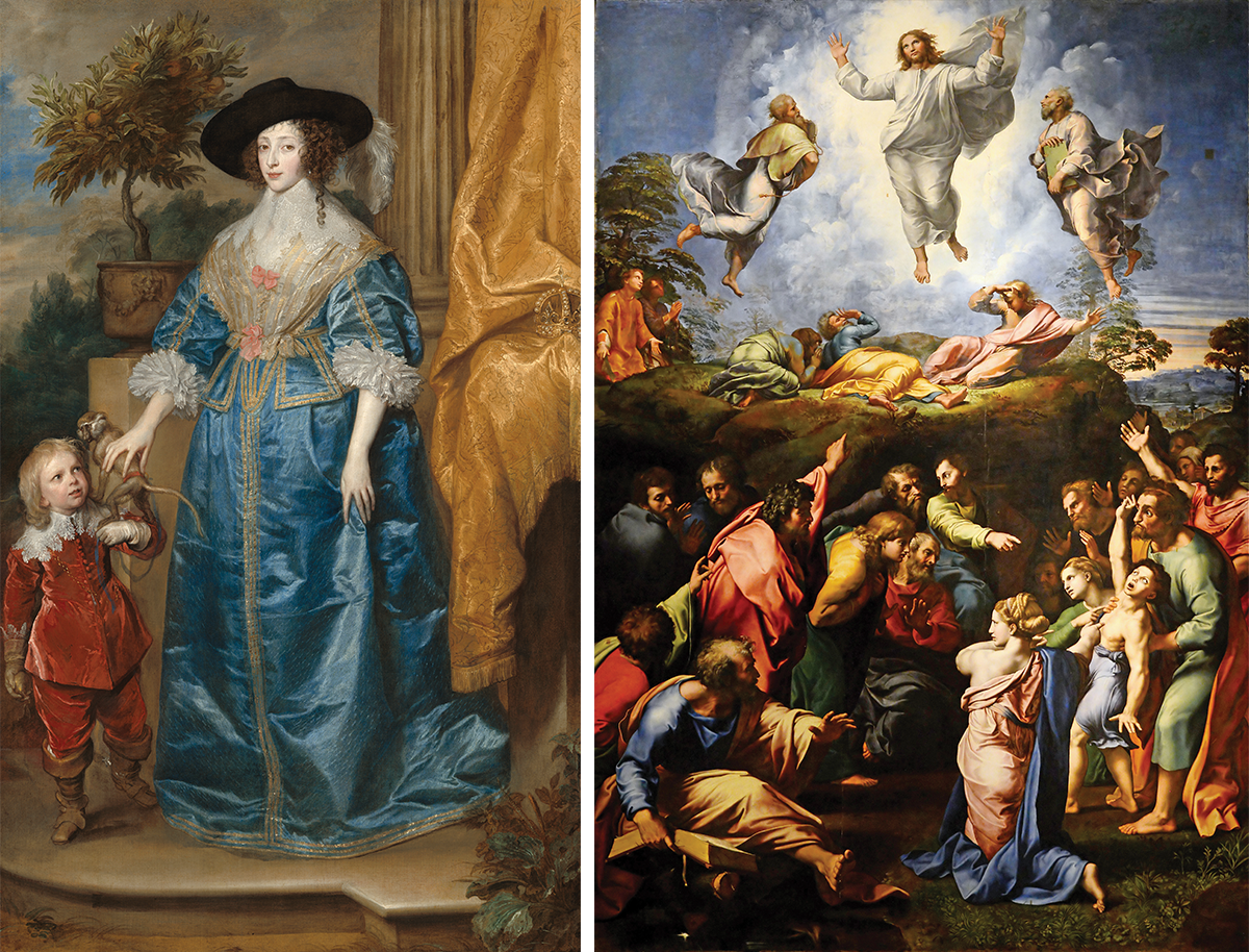
The vertical format is critical in Anthony van Dyck’s Queen Henrietta Maria with Sir Jeffrey Hudson, left, and The Transfiguration by Raphael, right. (National Gallery of Art)
Turn the horizontal rectangle vertically, and everything changes. Consider the kind of full-scale portrait perfected by the Flemish Baroque painter Anthony van Dyck. The power, accomplishment, and rectitude of his subjects are reinforced by their vertical format. We look up to those figures, holding them in high regard. We raise or lower our eyes in wonder, as if seeing a skyscraper for the first time. If the horizontal lends itself to narrative time, the vertical might be made for epiphanies, for momentary, momentous realizations. In vertical Chinese brush paintings of the misty mountains of Hunan Province, with the sky above and the mud below, the format itself suggests hierarchy. Heaven is up, earth is down, with varying degrees of access from one realm to the other. The late art historian David Smith contrasted the Catholic aesthetic, in paintings such as Raphael’s towering Transfiguration, in which all parts of the format’s space are easily accessible, to the Protestant aesthetic, as in many of Rembrandt’s drawings, where leaps in virtual space are needed to get from one disjunctive location to another. The first reflects a belief that those of us well behaved here on earth will gain fluid entry to heaven. The latter posits that only grace will bridge the yawning gaps of unworthiness.
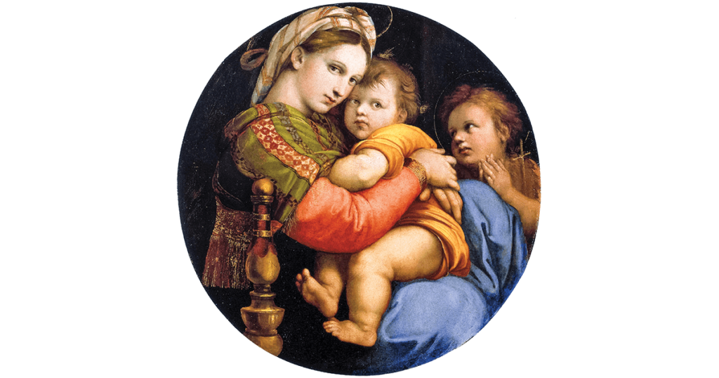
What happens when the rectangle’s height and width approach each other and finally become identical? The square might evoke timelessness, but it’s a tough format because its balance also implies stasis, a moment contained, and it is less often used than one might think. A circle can tuck into a square like an old LP record in its jacket, a confluence that intrigued Leonardo, whose famous Vitruvian man is the measure not just of his own squared circle but also of the universe itself. A circle can bloom into a sphere, perfectly packed within a cube, carrying intimations of cyclical time or heavenly perfection. We can read Raphael’s Madonna della Seggiola—an example of a tondo, or circular work of art—as a spherical space, bulging out toward us and away at the periphery. (See p. 99.) Still smaller subspheres are embodied by the three heads in the painting. The Virgin’s red-clad arm divides the surface into a quite clear yin-yang configuration of interlocking commas. The close-knit upper bodies of Mary and Jesus form one comma head, and this subcircle might suggest its own smaller yin/yang as well. Commas, like comets, imply movement, and we feel the whole format wanting to rotate. (The bedpost acts as a brake, helping to slow down an otherwise giddy spin.)
The metaphorical, even metaphysical, implications of the tondo can be consciously played off against those of the square. Consider one of Albrecht Dürer’s woodcuts depicting the Virgin Mary crowned by two angels. As Mary hovers in a heavenly bubble above a stark and worldly landscape, these two formats have a chance to compete, as if the old LP were floating free of its jacket. The tondo seems to compress Mary claustrophobically, squashing her into an almost fetal position of the sort shared by her child, but the facial expression on her central, almost spherical head seems contented enough. She has traded the confining rectilinear fence for a new circular corral, but she has managed to escape the bleak and sterile freedom of the borderless earth below. If her tondo implies cyclical time, the broken square below points into a void, with no temporal or spatial guidelines. Dürer had not only an otherworldly dexterity for wood engraving but also a genius for thinking profoundly about pictorial structure.
The rectangle and the circle can be more happily reconciled—as shown by any number of Ascension scenes in which earth and heaven are unified—by making one new format. In Federico Barocci’s The Vision of Saint Francis, his use of the amalgamated format clearly reflects the sphere above, the box below. (In Italian, the word disegno can signify both drawing and composition, and we’re told that Barocci, while underrated today, was so envied for his disegno that he was poisoned by jealous rivals. Better to be underrated, perhaps.) The supplicant Saint Francis has to lean way into our space to try and peer above the cloud on which his savior floats. Our earthbound location is defined by stiff verticals and horizontals, with two pilasters squeezing Francis like a pair of bookends. Above, in the curvilinear realm, the nimbus surrounding the head of Jesus sends out fluid waves that break on the rocky architectural shoals below. All is palpable, as Christ walks on air above us, and Francis leans toward us so far that his hand breaks the picture plane.
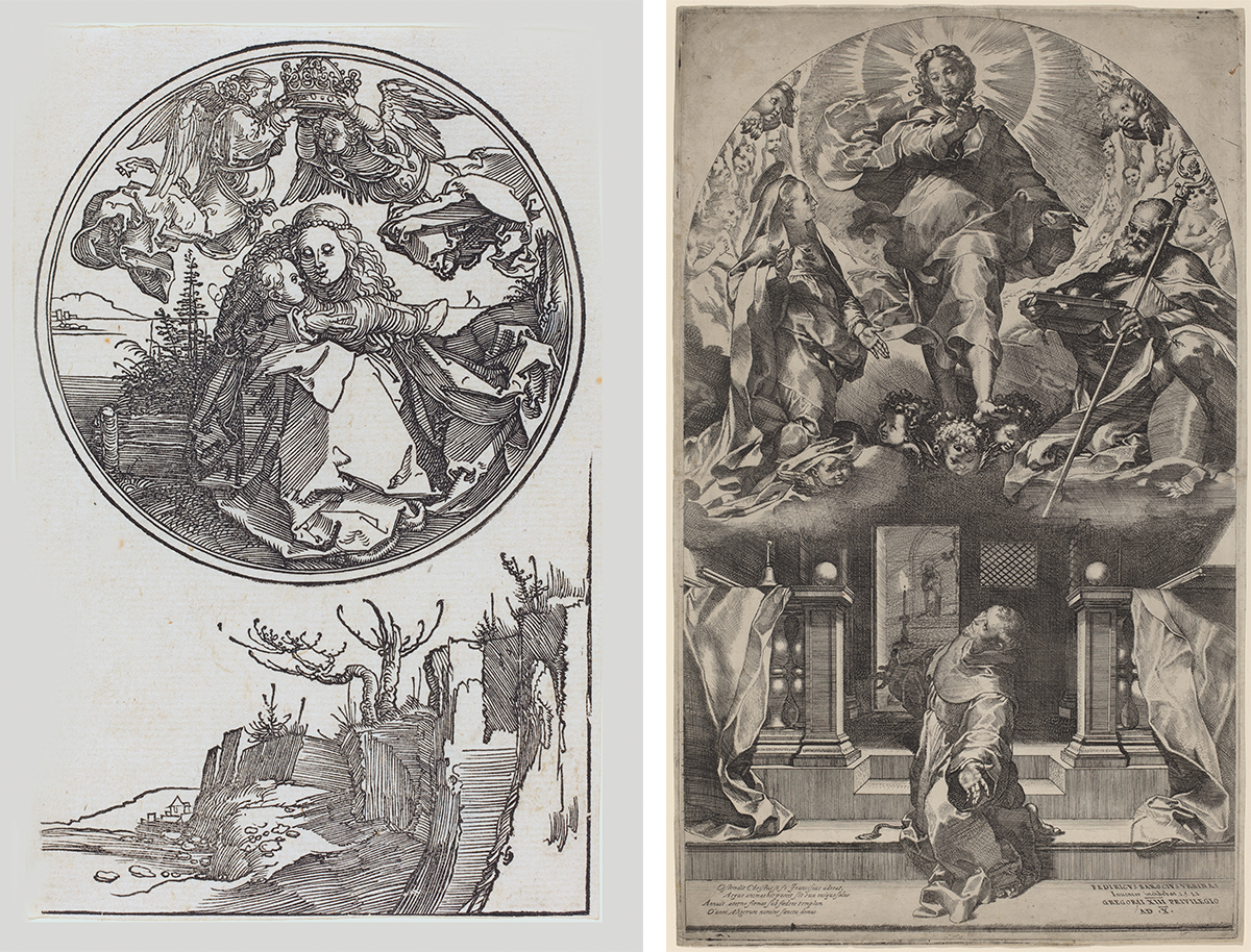
Left: Dürer’s woodcut depicting the Virgin Mary hovering above a landscape; right: Barocci’s The Vision of Saint Francis
Is this a frustrated desire to break free of two-dimensional space and enter into the world of sculpture? I don’t think so. Format is also a threshold, the border between our space, our reality, and a fictional world within. This transition from real to illusory is as permeable as most borders, such that Saint Francis meets us halfway, projecting into our space, in order to apprehend what resists framing.
Barocci’s contemporaries started painting church ceilings with very credible clouds that emerge with their holy freight from their restraining frames, at precisely the time when people were becoming hyperaware of the precarious line between reality and fiction. Shakespeare’s famous “All the world’s a stage, / And all the men and women merely players” was one of the favorite tropes of Barocci’s age—not just an artful conceit, but a woozy sense that reality is profoundly open to interpretation, that we’re in a reciprocal, mirrorlike relation with illusion. Barocci’s work strikes me as much more compelling than, say, a clever performance, or a magic trick. Is Francis really seeing Christ? Or are we watching a man, like Hamlet, wondering whether the ghost of his dead father is “really” there? Elsewhere, other forms threaten to fall out of their format altogether, as they do in Ludovico Carracci’s Saint Sebastian Thrown Into the Cloaca Maxima (see p. 100). Roman soldiers are dumping the saint’s dead body into their sewer system, but we feel that Sebastian’s corpse might emerge from the painting and land right at our feet. Where saints might descend from above in a vertical format, lightly riding a cloud, this Carracci work is all horizontal heaviness, a world of rock, gravity, and death.
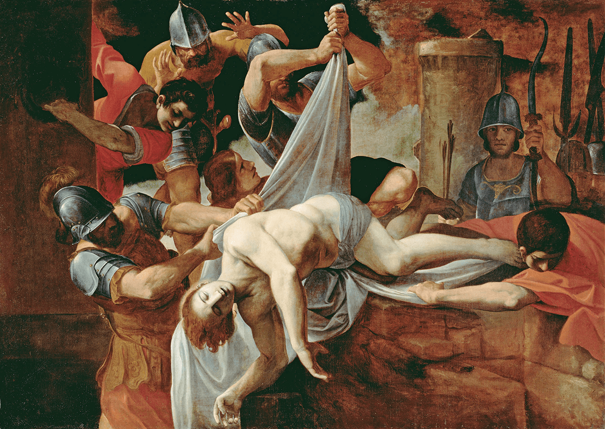
Carracci’s Saint Sebastian Thrown Into the Cloaca Maxima (1612): the body of the saint seems ready to tumble out of its format. (Wikimedia Commons)
The German Romantic artist Caspar David Friedrich went out of his way to imply extension and continuation left and right, top and bottom, off camera, so to speak. The concept of the sublime had recently been put forward to make sense of that which inspired terror or awe, defying comprehension or measure. This notion of the sublime was set against the frameability of the picturesque and the internal order of the beautiful, and it questioned whether we could describe, convey, or picture such experiences at all. Nevertheless, Friedrich looked for pictorial equivalents to give the sense of being dwarfed by nature, the rapture or dread we find in our own insignificance. His Chalk Cliffs on Rügen is meant to give us physical and metaphysical vertigo, for the painting makes the fatal drop-off coincide with his format’s bottom edge. If Saint Sebastian threatens to fall out of his format, in the Friedrich, we risk falling off the cliff edge and into the abyss. Humbled and awestruck spectators are our proxies in peering out at the horizonless fog or down into a measureless void.
For Mark Rothko, format is a box, into which his shapes are placed like sardines in a can. For Franz Kline, format is a way station through which to pass, or perhaps a plywood sheet on the road being driven over by muddy wheels. Such analogies are respectfully meant to give the viewer, or the artist trying to make a painting, some grasp of structural choice. You might apply the same ideas to music, poetry, dance—any number of art forms. The painter who uses format as a box, for example, might resemble the composer who writes in sonata form or the poet who opts for the clearly defined, bordered form required by the haiku, sonnet, or villanelle. Treating format as a runway might evoke the music of Philip Glass or John Adams, or the novels of Jack Kerouac, headlong rushes from here to there, East Coast to West, cover to cover. There are artists passionately committed to the self-contained work, a world in small with an internal order that might reflect or clarify our world but that stands proudly apart from reality. Others see this concept as deeply misleading and want to advertise continuity between our side of the canvas and what lies within.
Michael Fried (born in 1939) has been writing about this choice for some time, starting when, as a critic, he wanted to distinguish between contemporary art he deemed theatrical and art he called absorptive. These terms had been used by the 18th-century critic Denis Diderot, who condemned as theatrical work that addressed or included the viewer. Both critics considered Jean-Baptiste-Siméon Chardin’s paintings to be self-sufficient worlds, turned in and absorbed in their own order. As helpful as this assessment may be, however, I cannot understand how either Diderot or Fried could consider another 18th-century French painter, Jean-Baptiste Greuze, absorptive. A wise man once said, “Comedy is for those who think. Tragedy is for those who feel. Melodrama is for those who think they feel.” In canvases such as Broken Eggs and The Broken Pitcher, Greuze is playing to the audience so melodramatically, so desperately, and in my opinion so cynically that he could stand for theatricality at its worst.
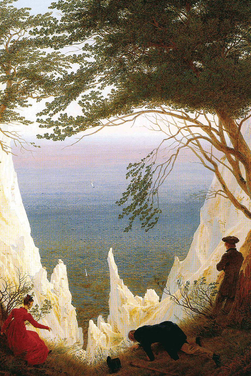
Friedrich’s Chalk Cliffs on Rügen (c.1818): with its figures peering over the edge, the painting “is meant to give us… vertigo.” (Wikimedia Commons)
Is there an ethical difference between art that connects inner with outer, and that which keeps to itself? Chardin is one of my favorite artists, as is Gian Lorenzo Bernini; why choose between them? Bernini was joyously, profoundly, and even explicitly theatrical—not only was he the leading sculptor of his time and a noted architect, he also wrote plays that would have driven Diderot berserk. Bernini was fascinated by the line between actor and audience. His staging of a flood scene in Inundation of the Tiber required that a mass of water come washing out toward the viewers, stopped by a barrier only at the last possible second. In his play The Fair, one of the actors intentionally set fire to the scenery on stage, allowing the audience to experience fear and panic before the flames were put out. Peter Paul Rubens also played with boundaries between reality and illusion, as in his oil sketches, little studies for history paintings in which the figures come to be seen as woven into a tapestry held aloft by grinning putti, straining to pull the cloth out to the limits of the format. Rubens and his putti challenge us to recognize that all the world’s a stage. If we can peel our reality like an onion, Rubens has found a brilliant conceit for this sense of layer upon layer of artifice.
In that thought-provoking Dürer engraving of Mary in her floating tondo, such centripetal containment could be praised as absorptive, as self-sufficiently, meditatively whole, or it could be rejected as overly constricting, cut off from the world and perhaps smugly symmetrical. Indeed, the metaphorical implications of borders in art could extend to the world beyond it. When nations try to determine how permeable their borders should be, it’s as if they were deciding between the closure of Mark Rothko and the openness of Franz Kline. The concept could apply to the earth itself; some might consider our planet to be claustrophobically limiting and yearn to break our gravitational boundaries to explore our cosmic context, a desire others would deem to be destructive, self-deluding escapism. We need both views, aspiring to visit the billions of alternate worlds while working not to destroy this one. Issues of individuality and the common good might be thought of as centripetal and centrifugal as well. Like consciousness, our bodies seem discrete and separate, but any Zen master will tell you that separateness is an illusion, that we are contiguous with the world while moving through it. Once again, I seem to be advocating a centrist acceptance of both proclivities. I cherish my mental image of the beautiful rural Welsh couple and the ruined castle, but there’s a part of me that wishes that I’d been able to take a photograph, to sneak a shot of that sweet flirtation. We are allowed to want it all.

