
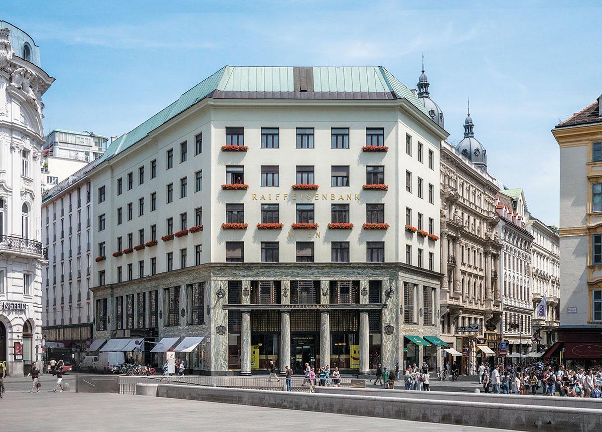
An afternoon walk in my downtown Philadelphia neighborhood sometimes takes me past the old Board of Education Building, an impressive limestone pile whose top is decorated with an assortment of busts—educators, scientists, and inventors, including Horace Mann, Isaac Newton, and Alexander Graham Bell. The nine-story building was constructed in 1932 in a style sometimes called Moderne, a fusion of Classicism and Art Deco that cheerfully blends tradition and fashion. The building faces the Benjamin Franklin Parkway, but I pass by the rear, where the service entrance is located. Its paneled door is surmounted by an elaborately carved pediment and an oversize ornamented scrolled bracket. The words service entrance are carved into the stone doorframe. The architect and design theorist Christopher Alexander once pointed out to me that everything in the physical environment—everything—either raises our spirits or dampens them. This service entrance always gives me a lift: somebody cared.
That somebody was Irwin Thornton Catharine, who as chief architect of the Board of Education was responsible for designing more than 100 schools across the city. Unlike many leading architects at that time, Catharine didn’t attend the École des Beaux-Arts or even a local university. He received an architecture certificate from the Drexel Institute of Art, Science and Industry, a trade school. He was lucky to get the job as chief architect, though it didn’t hurt that his father chaired the Board of Education. Nevertheless, his experience at Drexel provided him with a toolbox of design skills that enabled him to turn a humble service entrance into something substantial and beautiful, something to raise the spirits.
Is there any doubt that a service entrance designed in 2023 would be very different? Contemporary architects would scoff at the console bracket with its carved garlands, the paneled and studded door, and the fanciful Art Deco pediment. What is the function of all that bric-a-brac? they would ask. Why all the fuss when a flush door with a thin steel frame would do just as well? Why carve words when a ready-made embossed plastic plaque is available? Isn’t it all just a waste of money?
Similar questions were posed a long time ago, in a lecture given in Vienna on January 21, 1910. The venue was the Akademischer Verband für Literatur und Musik, an association of university students and their friends that organized avant-garde concerts by the likes of Arnold Schoenberg and exhibits by young firebrands such as Oskar Kokoschka and Egon Schiele. The lecturer that January evening was not so young, a 39-year-old Moravian-born architect named Adolf Loos, but he was definitely a firebrand. He titled his talk “Ornament und Verbrechen” (Ornament and Crime), and his theme, encapsulated in the title, was that ornamentation was both uneconomical and morally wrong; therein lay the crime. The lecture, which was actually more like an extended harangue, consisted of stirring if unproven pronouncements: “The evolution of culture is synonymous with the removal of ornamentation from objects of everyday use”—an assertion difficult to prove, since in 1910 both machine tools and steam locomotives often incorporated ornament. Nevertheless, to Loos, ornament was a throwback to a primitive time and had no place in the modern world. “Ornament is wasted labor and hence wasted breath,” he declared. “That’s how it has always been.” One can hear the outrage in his voice. The architect’s particular bugbear was tattooing. “Tattooed men who are not behind bars are either latent criminals or degenerate aristocrats.” The latter presumably referred to the current fashion for tattoos among European royals, including Edward VII, Kaiser Wilhelm II, and Tsar Nicholas II.
The unadorned Looshaus in Vienna (Wikimedia Commons)
Loos was critical of the Vienna Secession movement, to which he had briefly belonged. He especially criticized the use of ornament by its most prominent member, the architect Otto Wagner. Loos—whose own practice at that time was limited to interiors, mostly small shops and cafés—was vague about exactly where a prohibition on ornament would lead. That may be why the Akademischer Verband did not publish his lecture in its journal, Der Ruf. The first appearance of “Ornament and Crime” in print was in French, in the June 1913 issue of Les cahiers d’aujourd’hui, a Parisian art magazine. The essay got additional exposure seven years later, when the Swiss architect Charles-Édouard Jeanneret, who had recently assumed the nom de plume Le Corbusier, reprinted it in his art and architecture magazine, L’esprit nouveau, referring to Loos as “one of the predecessors of the new spirit.” By then, Loos had several unornamented suburban villas to his credit. His best-known building, the seven-story block now called the Looshaus, occupies a prominent location in central Vienna. The plain upper floors, with white-painted plaster punctuated by undecorated windows, were controversial at the time, not least because the Emperor Franz Joseph, whose home, the Hofburg Palace, overlooked the Looshaus, had expressed his intense disapproval.
“Ornament and Crime” first appeared in German in the daily Frankfurter Zeitung in 1929, only four years before Loos’s death, but by then the essay had become influential in the nascent modernist movement. The awkward truth was that although architects such as Le Corbusier proclaimed the need for a new architecture to suit the machine age, their buildings were technically rather crude, especially when compared with such “traditional” buildings as Cass Gilbert’s Woolworth Building (completed in 1913), which, despite its Gothic tracery and gargoyles, was technologically and structurally advanced. What really distinguished the new architectural spirit was not how its buildings worked or how they were constructed but rather how they looked—that is, unornamented, a strategy for which Loos’s heated rubric provided a ready rationale.
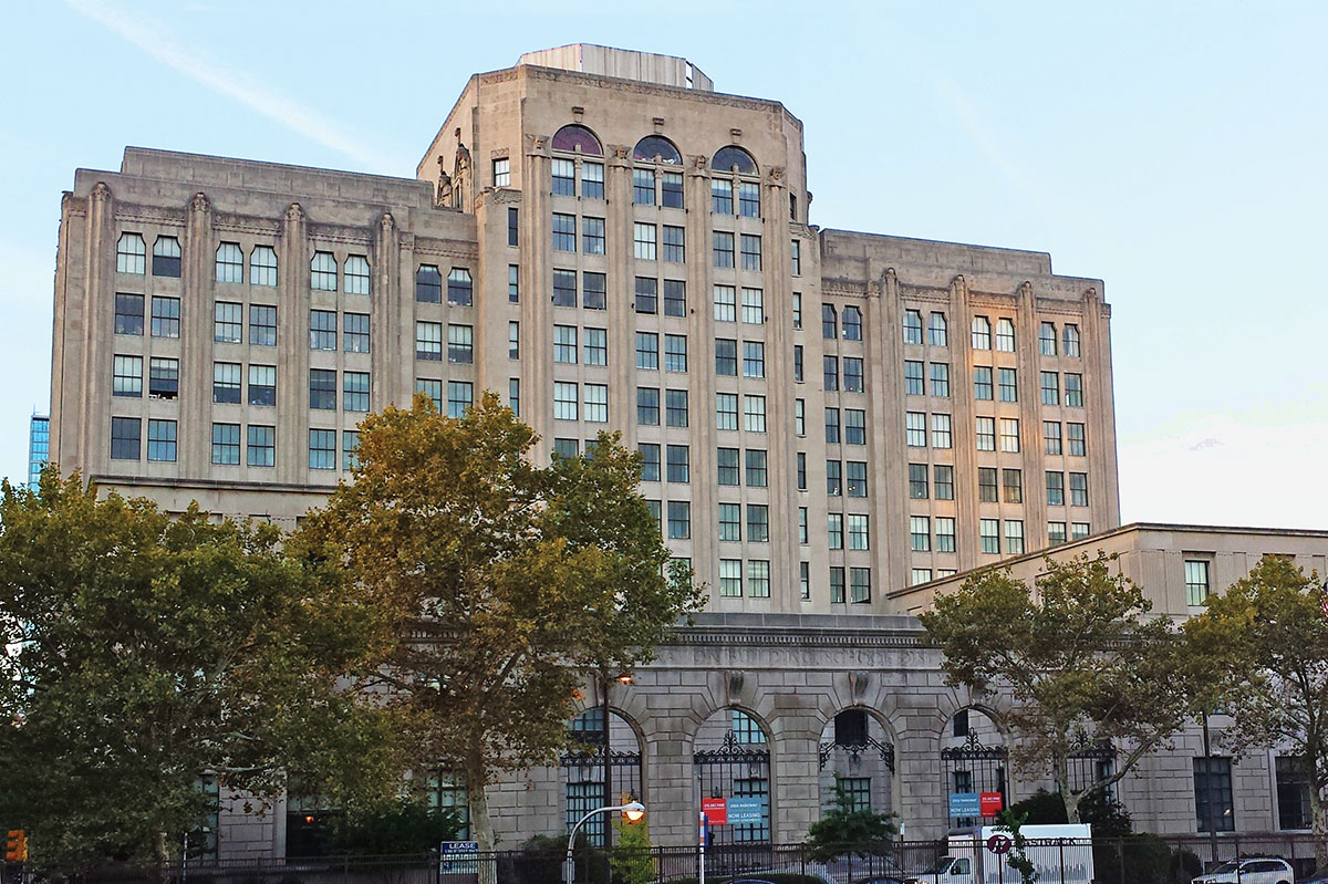
The Board of Education Building in Philadelphia, designed by Irwin Thornton Catharine (Wikimedia Commons)
Loos made ornamentation sound like something practiced only by primitive peoples or criminal deviants. But even a cursory glance at history demonstrates that ornament has always played a role in architecture, whether on ancient Greek temples, Gothic cathedrals, Renaissance palazzos, or the Board of Education Building in Philadelphia. Indeed, it is often the nature of the ornament that distinguishes different historical periods. The reason for this persistence is that far from being superfluous, architectural ornament performs several useful functions. In “The Mischievous Analogy,” an essay based on a 1941 lecture at the Architectural Association in London, John Summerson described two historical roles for ornament. The first he called surface modulation—that is, the patterns, moldings, and other decorative devices that architects used to make blank walls visually interesting. Examples from three cities illustrate this simple but essential function.
In Venice, the Palazzo Ducale, or Doge’s Palace, housed the apartments of the elected head of state, the meeting halls of the ruling bodies of the city, and the law courts. The palazzo comprises a group of 11th- and 12th-century buildings that, over the ensuing centuries, were consolidated into a single complex. The two lower floors of the main façade, overlooking the lagoon, consist of an open loggia superimposed on an arcade. The mostly blank upper floor houses the vast Sala del Maggior Consiglio, or Chamber of the Great Council. The exterior wall, like most medieval Venetian buildings, is constructed of brick. Covering the brick, a veneer of pink and white marble tiles creates a pattern of alternating diamond shapes, a shimmering mosaic that extends over the entire 230-foot-long façade and around the corner. This mesmerizing architectural wallpaper is what many visitors remember best about the Doge’s Palace.
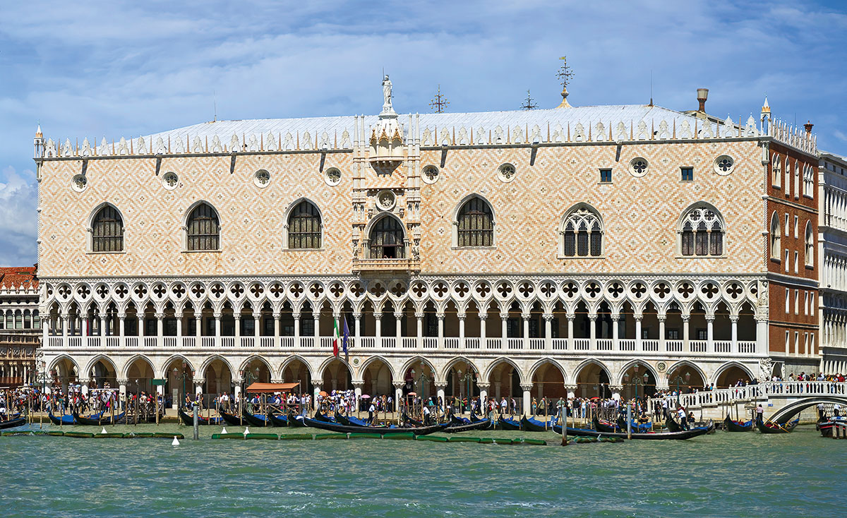
The Doge’s Palace in Venice (Wikimedia Commons)
In Vienna, Otto Wagner built the Majolikahaus apartments on the city’s fashionable Linke Wienzeile in 1899. The six-story block is a reinforced concrete frame with brick exterior walls; the lower two floors are commercial spaces, and the upper floors house apartments. Wagner himself was the real estate developer as well as the architect, and being budget minded, he designed a flat brick façade punctuated by a regular arrangement of identical rectangular windows. Then he did something surprising, not to say daring. He covered the brick with multicolored glazed ceramic tiles in rose patterns that made the façade resemble a vibrant floral tapestry. The architectural logic of this flamboyant horticultural gesture? “This is not a structural wall so it can be decorated any way I like.”
In Washington, D.C., the neoclassical West Building of the National Gallery of Art was completed in 1936. It is a massive structure of pink Tennessee marble sparsely ornamented with pilasters and a variety of moldings, panels, and cornices, interrupted only by a monumental Ionic portico at the entrance. The architect, John Russell Pope, orchestrated the subtle variations so skillfully that walking along Constitution Avenue, you hardly notice that the 782-foot façade is entirely windowless, as blank as the back of an IKEA warehouse—all the galleries, as well as the sculpture halls and garden courts of the museum, are skylit. Pope boldly underlined this fact by including some false windows—a device commonly used by Renaissance architects when they needed to balance the composition of a façade.
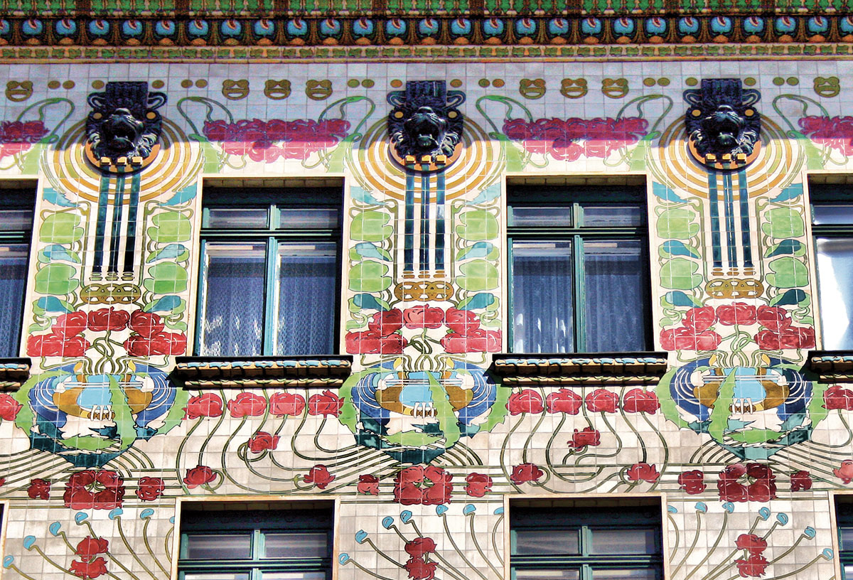
Otto Wagner’s Majolikahaus apartments in Vienna (Wikimedia Commons)
Summerson called his second category of ornament subjunctive architecture—that is, “as if something were otherwise than it is.” Among the oldest examples of such ornament are the leafy column capitals that originated in ancient Egypt (palm fronds and lotus buds), were adopted by the Greeks (acanthus leaves), and were further refined by the Byzantines, whose diaphanous marble capitals are so delicately carved that they appear to be made of lace. Whether palm fronds or flowers, such insubstantial forms have the effect of making the beams above seem to float.
Pilasters, which are flattened columns with no structural function, are another example of subjunctive architecture. So are Renaissance frescoes, which often include putative arches and columns. This was partly a question of cost—painted columns were cheaper than the real thing—but it also had to do with the curious appeal of trompe-l’oeil, literally “tricking the eye.” We see one thing, yet we intellectually know another. I’m not sure why this is so beguiling, but it is.
Classical Greek columns could assume the form of human figures, the most famous being the six winsome maidens, or caryatids, that support the porch of the Erechtheion on the Athenian Acropolis. The woven reed baskets the young women carry on their heads remain mysteriously unsquashed by the heavy marble roof beam. The male equivalent of the caryatid was the atlante, 10 of which support the neoclassical porch of Leo von Klenze’s New Hermitage museum (1842–1851) in St. Petersburg, Russia. The postmodern architect Michael Graves used human figures as columns in the façade of the Team Disney Building in Burbank, California. The brawny atlantes are granite, whereas Graves’s cartoonish Seven Dwarfs are made of glass fiber reinforced concrete, but the idea is the same.
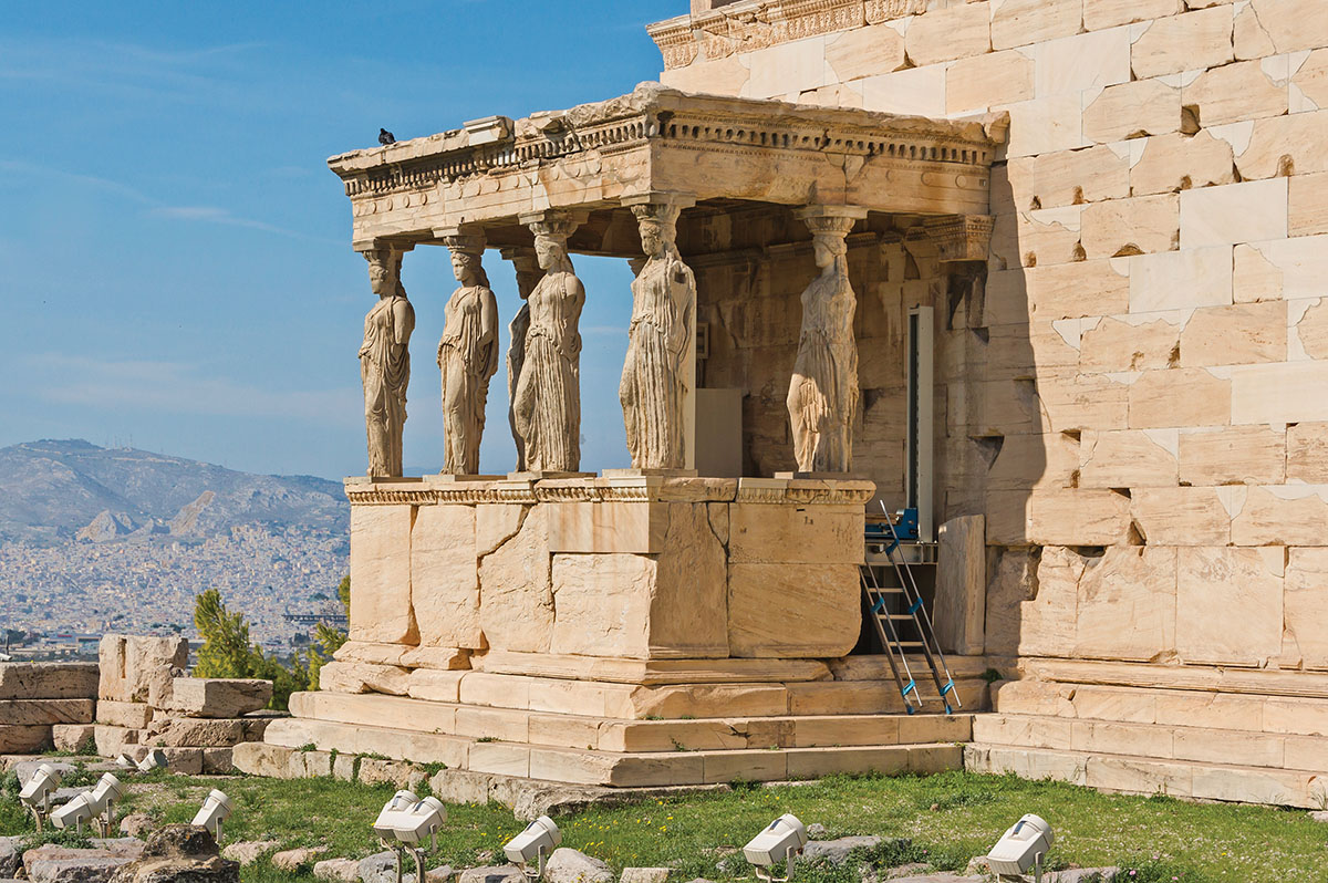
Caryatids—columns in the form of Greek maidens—decorate the porch of the Erechtheion at the Acropolis in Athens. (Wikimedia Commons)
Summerson identified two sorts of ornament in his talk, but while I was researching my recent narrative history, The Story of Architecture, I came across three more. The first has to do with meaning. Abstract building elements—columns and beams, roofs and walls, doors and windows—cannot convey meaning except in the most rudimentary way, yet there is sometimes a need to endow important buildings, such as places of worship, city halls, or public libraries, with a special significance. That is where ornament comes in.
The Parthenon was built on the site of a temple that had been destroyed by the Persians during the sacking of Athens in 480–479 BC. The rebuilt structure, then, which served as the city treasury, became a sort of war memorial. The colonnade surrounding a boxlike chamber, or cella, followed the traditional arrangement for Greek temples, but it was the metopes, or carved panels of the entablature frieze, that conveyed the commemorative meaning. The warring figures carved in high relief—centaurs, Lapiths, Amazons, and giants—represent the theme of order versus chaos and serve as a metaphor for the eventual Athenian victory over the Persians.
Jumping forward 2,300 years, the Folger Shakespeare Library in Washington, D.C., is an example of a 20th-century building that incorporates meaningful ornament. The library, which houses Henry Clay Folger’s collection of Shakespeareana, opened in 1932 and was designed by Paul Philippe Cret, a prizewinning graduate of the École des Beaux-Arts who had come to the United States to teach at the University of Pennsylvania. Cret, who also designed the Detroit Institute of Arts and the Indianapolis Central Library, eventually developed what he called New Classicism, which largely dispensed with traditional columns and pilasters while preserving a classical sense of proportion, balance, and symmetry; his critics called it “starved Classicism.” The main architectural elements of the Folger’s façade on East Capitol Street are nine tall windows separated by fluted panels that vaguely suggest pilasters. Beneath each window is a six-foot-square marble panel, its low-relief carving depicting scenes from the Bard’s plays, including Macbeth, Julius Caesar, King Lear, and Richard III. These panels are also examples of subjunctive ornament, since low-relief carving creates the illusion of depth despite being almost flat.
Chicago’s Harold Washington Library, which was designed by Hammond, Beeby & Babka in 1987, is a rare example of a contemporary building that incorporates ornament. This includes scrolls inscribed with the city’s motto, Urbs in Horto; terracotta medallions with puff-cheeked cherubs personifying the Windy City; and window spandrels in the shape of midwestern sheaves of cornstalks. The most dramatic ornaments are huge cast-aluminum barn owls and a horned owl clutching a book, the birds perched high up on the eaves.
Although owls are traditional symbols of wisdom and refer to the library’s function as a storehouse of knowledge, the meaning of architectural ornament does not have to be literal; sometimes the ornament is there simply to convey that “this is a special place.” The two larger-than-life-size marble lions that have guarded the main steps of the New York Public Library since 1911 were not originally intended to represent either wisdom or the city—they are just lions. There is no obvious link between the maned beasts and the library, yet in an entirely serendipitous fashion, the two big cats—since named Patience and Fortitude—have become much beloved mascots of the institution. For many New Yorkers and visitors alike, it is this pair, gazing placidly over Fifth Avenue, even more than Carrère and Hastings’s severe Beaux-Arts architecture, that makes the library so memorable.
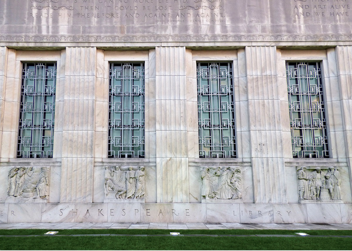
The Folger Shakespeare Library in Washington, D.C., designed by Paul Philippe Cret (Wikimedia Commons)
Meaningful ornament, whether it is Greek metopes, Shakespearean bas-reliefs, or sculpted lions, is usually the work of artists. We don’t know the names of the sculptors of the Parthenon metopes, but the New York lions were modeled by Edward Clark Potter and carved by Picarilli Brothers, the firm responsible for Daniel Chester French’s monumental statue in the Lincoln Memorial. The Shakespearean bas-reliefs at the Folger were likewise carved by Picarilli Brothers, based on models made by the sculptor John Gregory, and the Chicago owls are the work of sculptor Raymond Kaskey. The presence of these artists points to a less obvious effect of architectural ornament: the introduction to a building of an artistic sensibility.
When an architect designs everything in a building, not just the architecture but also the décor, the lighting fixtures, and the furniture—as Frank Lloyd Wright did in many of his houses—we refer admiringly to the result as a Gesamtkunstwerk, a total work of art. But is total control over design really so admirable? Or is it just too much of a good thing? Ever since the ancient Greeks, buildings have benefited from the work of artists whose creativity complements that of their architects. The variety of sculptural figures and stained-glass windows is an integral part of the experience of Gothic cathedrals, just as frescoes enliven Renaissance churches, council chambers, and residences. When the architect Charles McKim invited Edwin Austin Abbey, Pierre Puvis de Chavannes, and John Singer Sargent to paint murals in the newly built Boston Public Library, he allowed the artists to choose both theme and treatment. McKim understood that creative diversity would enrich the experience of his building.
“I should like to be merely one of the three people to produce a building,” explained McKim’s younger colleague Bertram Grosvenor Goodhue. “I should like to do the plan and the massing of the building; then … turn the ornament (whether sculpture or not makes no difference) over to a perfectly qualified sculptor, and the color and surface direction (mural pictures or not as the case may be) to an equally qualified painter.” Note that Goodhue said “turn over”—he wanted the collaborating sculptor and painter to bring their own sensibilities to the project.
When Goodhue won the competition to design the Nebraska State Capitol in 1920, he invited several artists, including the muralist Hildreth Meière and the sculptor Lee Lawrie, who were already working with him on the National Academy of Sciences in Washington, D.C., to join him. At the state capitol, Meière was responsible for the mosaic ceiling of the domed rotunda, as well as wall paintings, tapestries, floor mosaics, and ceremonial door panels throughout the building. Lawrie’s high-relief exterior sculptural figures, portraying historic lawgivers, were integrated—literally—into Goodhue’s architecture, and seem to melt into the Indiana limestone walls. The centerpiece of the capitol is its 400-foot tower, and Lawrie created the bronze statue that stands atop it: The Sower portrays a barefoot Nebraska farmer, pants rolled up, bag on his shoulder, casting seed for planting.
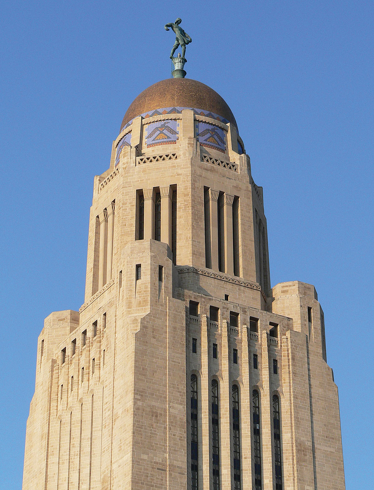
The Nebraska State Capitol resulted from significant collaboration between architect, muralist, and sculptor. (Wikimedia Commons)
In the early 1930s, Cass Gilbert designed the United States Supreme Court Building in the neoclassical Roman style of which he was a master. Gilbert commissioned many artists to ornament the walls, resulting in allegorical figures on the exterior, busts of the chief justices in the Great Hall, and a frieze in the courtroom. He gave the entrance special attention. There is a long tradition in important buildings of monumental doors sculpted with figural panels—Lorenzo Ghiberti’s famous doors for Florence’s Baptistery being a preeminent example. The 17-foot-high bronze doors of the Supreme Court Building are divided into eight panels illustrating the Code of Justinian, the Magna Carta, and the Marbury v. Madison decision, among other significant events. The low-relief panels were designed by Gilbert and the stone carver John Donnelly, who also worked on the U.S. Capitol and the Library of Congress, and were sculpted by Donnelly’s son, John E. Donnelly Jr. Obviously the Supreme Court Building doors are an example of the use of ornament to convey meaning, but they also illustrate its fifth function: to provide something to look at.
This sounds trivial, but in a way, it is the essential function of ornament. Architectural ornament, by its very nature, is intended to be seen close-up. Viewing the Doge’s Palace from the lagoon, for example, which is how travelers in the past arrived in Venice, one is aware only of a large block with two arcades at its base. The exquisite carving of the colonnade and the lacy tracery of the loggia are not apparent; neither are the pink-and-white patterns of the wall above. These details come into focus only as one approaches, and one must be quite close to the central balcony to make out the high-relief sculpture of the doge kneeling in front of the winged lion of Saint Mark. Different distances, different experiences.
Le Corbusier once described architecture as “the magnificent play of volumes brought together in light,” and so it is. When we view the Supreme Court Building from a distance, for example, what we see is precisely a play of volumes: the great steps, behind them a monumental temple front with eight giant columns casting shadows into the deep portico, and behind that a long, low building forming a sort of backdrop. As we approach, the ornamental details become legible. Two seated figures, symbolizing the Authority of Law and the Contemplation of Justice, flank the stairs. Now we can distinguish the fluting and the capitals of the Corinthian columns, and we can see that the pediment is filled with sculpture: Liberty holding the scales of justice flanked by allegorical figures. The sculptor, Robert I. Aitken, gave these figures the features of actual persons involved in realizing the building, including Chief Justices John Marshall and William Howard Taft. He also, rather cheekily, included himself. We may not recognize Marshall and Taft, but we can certainly identify the inscription below the pediment: “Equal Justice Under Law.”
What do we lose when we get rid of ornament? Quite a lot, it turns out. What to do with large blank walls remains a problem. Buildings are often windowless—not only art galleries, but also theaters, courthouses, and convention centers—and without a way to modulate surfaces, we are left with large expanses of metal, brick, or worse, concrete. Brick is a noble material with a long history of ornamental variety in the form of different courses, bonds, glazes, and colors, but absent these, a brick wall can soon become monotonous. Still, it’s more attractive than bare concrete. Some architects recognized the shortcomings of concrete early. Le Corbusier used rough wooden-plank forms to create a more varied surface, knots and all. Paul Rudolph worked valiantly to create ribbed concrete surfaces that produced interesting shadows, but in a large building, even textured concrete can be, well, boring. Others, like Tadao Ando, made the concrete as smooth as glass, as if that would help—it didn’t. Louis Kahn devoutly eschewed anything that smacked of ornament, but at the end of his life, he seemed to relent, decorating the rough-cast concrete walls of the National Capitol of Bangladesh in Dhaka with horizontal bands of marble, a small but effective ornamental detail.
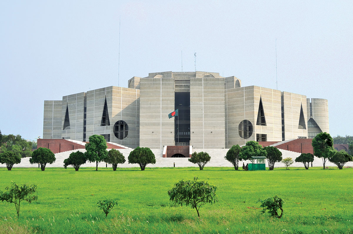
The National Capitol of Bangladesh, designed by Louis Kahn (Wikimedia Commons)
Because integrity and honesty are highly prized by modern practitioners, subjunctive architecture—making things that are not what they appear—has few adherents. This tends to produce less variety than in the past. A traditional wrought-iron balustrade, for example, can take on a variety of evocative forms—rippling waves, a knotted rope, climbing ivy—whereas an undecorated handrail tends to follow one of a small number of generic solutions: plain steel bars, sheets of tempered glass, or the stretched wires favored by some architects. Classical columns with capitals and bases could be more or less intricate, more or less luxurious, depending on the building, but delete those options and you are left with an unexpressive post, the same whether it’s in a shopping mall or a courthouse. In that regard, the loss of subjunctive architecture represents the loss of nuance.
What about the role of ornament in conveying meaning? One of Paul Cret’s late designs is a small chemistry building at the University of Pennsylvania, where he was a longtime professor. Built in 1940, five years before he died, the no-nonsense laboratory is plain brick with limestone trim and ribbon windows in the International Style. But Cret being Cret, there is an ornamental feature. The low-key entrance—bronze double doors protected by a shallow limestone canopy—is surmounted by a large low-relief limestone panel sculpted by Donald De Lue. The Alchemist depicts an old man in medieval garb holding an orb and surrounded by chemical apparatus. There is no other sign. The panel says it all.
The abandonment of ornament has levied a heavy toll on the practice of architecture, tantamount to misplacing a crucial instrument of one’s toolbox. With ornament, an architect could give meaning to a building not only by incorporating specific references to what went on inside, as Cret did in his chemistry building, but also by simply dialing the intensity up or down. Thus the main entrance of the Philadelphia Board of Education Building is not merely larger than the service entrance, it is more elaborately decorated, topped by two winged female figures and a medallion containing what looks like a coat of arms. Without subjunctive ornament, a building risks being less nuanced, but without meaningful ornament, it risks becoming, well, meaningless.
The banishment of ornament means an end to the close collaboration between architects and artists. It is difficult to imagine an architect today saying, “I should like to do the plan and the massing of the building; then … turn the ornament over to a perfectly qualified sculptor, and the color and surface direction to an equally qualified painter.” Today, the art in public buildings tends to be divorced from the architecture. A large travertine sculpture, Henry Moore’s Reclining Figure, stands outside Marcel Breuer’s UNESCO Building in Paris. Inside is a Picasso mural, The Fall of Icarus. The sculpture and the mural are beautiful works of art, but they have nothing to do with the architecture. They are simply “a Henry Moore” and “a Picasso.” The days when architects and artists worked closely together are long gone, and the results are not necessarily architecture that is worse, but architecture that is more one-dimensional: a long solo unenlivened by the occasional duet.
Take away ornament, and what are you left with? When we get close to a building today, we are confronted by gaskets, caulking, nuts and bolts—the minutiae of building construction. Or worse: exit signs, ventilation grills, and fire-hose cabinets. There is an architectural consequence to this. Traditionally, buildings were built as relatively straightforward boxes, their distinctive quality provided by ornament. Lacking the latter, architects feel obliged to provide dramatic cantilevers, unusual shapes, vertiginous space, and soaring roofs. But these big moves are not balanced by the finer-grained experience of small moves—that is, by ornament.
So where does that leave us? Loos’s claim notwithstanding, ornament has not proved to be incompatible with modern life; we continue to decorate our homes and ourselves. Just look at sneakers and T-shirts, not to mention, pace Loos, tattoos. Many laptops are adorned with stickers and decals, and what about those smartphone cases decorated with William Morris and Art Nouveau motifs?
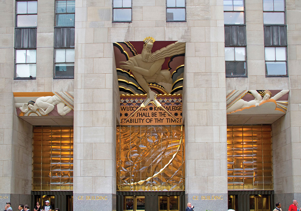
New York’s 30 Rockefeller Center (the RCA Building), with its distinctive main portal (Wikimedia Commons)
Nor is ornament incompatible with modern architecture. In the 1930s, American architects and artists demonstrated how the two could happily coexist. I am referring to Rockefeller Center in New York, with its multitude of artworks in the form of bas-relief panels, allegorical figures, carved plaques, lobby murals, elevator doors, mosaics, even tree grates. Although there are freestanding sculptural figures, such as Paul Manship’s Prometheus or Lee Lawrie and René Paul Chambellan’s Atlas, most of the artwork is integrated with the architecture—that is, carved directly into the limestone walls. The styles vary considerably, from what became popularly known as Art Deco to both abstract and representational art, but the works are executed with verve and individual conviction.
The centerpiece of Rockefeller Center is the 66-story RCA Building—30 Rock of TV sitcom fame—designed by a team of architects headed by the great Raymond Hood, and still one of the best Manhattan skyscrapers. The unadorned limestone piers separate columns of windows that soar skyward out of sight—as abstract as any glass box by Mies van der Rohe. Yet at ground level, the ornament of its three entrances rivals the portals of Notre-Dame. The large polychrome bas-relief panels of carved limestone and cast glass with gilded accents are the work of Lee Lawrie and colorist Léon-Victor Solon. The main portal portrays a bearded God and bears a quotation from the Bible: “Wisdom and Knowledge Shall Be the Stability of Thy Times.” The flanking portals represent Sound (radio), a male figure calling out to those below, and on the other side, his female counterpart, Light (motion pictures and television), sending electrical messages through the air. Modulated surfaces, subjunctive architecture, meaning, an artistic sensibility, and something to look at—it’s all here.

