Latitude for Error
The maps of the 18th century were beautiful works of art, but they sometimes led to disaster

Before embarking on a road trip, the first thing most of us do is program a Garmin or TomTom. When exploring a new city, we rely on our cell phones to navigate unfamiliar streets. Even a NASA mission to Mars or Pluto, we imagine, will follow a route through space that has been mapped out with unnerving accuracy, leaving nothing to chance. So confident are we in our 21st-century mapping devices, we often forget that cartography was not always a precise science—and that the maps of an earlier age, though undeniably artistic, often contained inaccuracies that led to disastrous consequences.
The highly colorful maps of the 18th century depicting the interior of North America, for example, caused great difficulties for battlefield commanders during the French and Indian War. Unlike the American Revolution, which was a political conflict, the French and Indian War was fought over territory. Vast distances of the American interior were contested, so accurate mapping of battle terrain was vital. As Paul E. Cohen, a dealer in antique maps and prints, notes, “the British had done a marvelous job of mapping the coastline, but there were really no good maps of the interior. Most of those were made up by cartographers using anecdotal evidence given to them by explorers, beaver hunters, and Indians.” Cohen and Richard H. Brown are the authors of a forthcoming book, Revolution: Mapping the Road to American Independence 1755–1783, which accompanies a traveling exhibition of some 60 original maps. Currently at the Boston Public Library, the exhibition moves to Colonial Williamsburg in 2016 and to the New-York Historical Society the year after that.
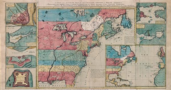
A wonderful example of early cartographic exaggeration is the Anti-Gallican Map, printed in 1755 (see p. 93). A militant anti-French trade group called the Society of Anti-Gallicans created the map with the aim of defeating the French and giving the British control of their colonies. It depicted British territory in bold red and French “encroachments” in a drab white. It also featured two thick lines, one brown, the other purple, demarcating the wide swath of territory that was in dispute. Even before the official declaration of war in 1756, then, the Anti-Gallicans had produced a map to show what was to be fought over. By exaggerating the territorial claims of the French, it served as brilliant propaganda. Politics, not accuracy, was the motivation of its creators.
Then there is the disastrous march of General Edward Braddock to take Fort Duquesne, the French stronghold at the confluence of the Allegheny and Monongahela rivers, the site of present-day Pittsburgh. Well before arriving in the colonies, Braddock had pored over maps in London, planning his attack. In early 1755, he and his forces set out from Virginia, dragging two-ton cannons along what looked like, according to his maps, the shortest route. Braddock’s route led him across the Alleghenies, an arduous journey that took a terrible toll, lasting months, not the weeks he had anticipated. “The authors of these maps,” Cohen told me, “not only miscalculated the distances, they had no idea of the terrain.” The British arrived downstream from the fort, arguably the worst point from which to mount an attack. When the battle commenced, they were lured into a narrow road along the Monongahela River. The French commander, Claude-Pierre Pécaudy de Contrecœur, hid 600 of his troops, mostly Indians, in ravines beside the road, and once they opened fire, bloody carnage ensued. Braddock was killed, and several of his commanders were seriously injured. Also present but unhurt was a young aide-de-camp, George Washington.
[adblock-left-01]
During the American Revolution, maps performed quite a different role, often serving as records of recent conflicts. I. De Costa’s map, “A Plan of the Town and Harbour of Boston … Shewing the Place of the Late Engagement Between the King’s Troops & the Provincials,” published on July 29, 1775, depicted the aftermath of the engagements at Lexington and Concord—troop positions and the locations of camps, with houses, churches, cannons, and tents all carefully drawn.
Fittingly, the end of nearly three decades of conflict would be commemorated with a map. In December 1782, the American peace commissioners—John Adams, Benjamin Franklin, John Jay, and Henry Laurens—assembled in Paris and watched as the British representative, Richard Oswald, took out his pen and drew the boundaries of the new country on what had been the standard map of America, created by John Mitchell back in 1755. Oswald was generous with his penmanship, laying down new borders with France in Louisiana and Canada, and with Spain in Florida. A copy was later given to George III—“a stinging reminder,” Cohen writes in the book, “of his tremendous losses in North America.” Indeed, a crucial source for both the exhibition and book was the extraordinary collection of maps assembled by George III, later bequeathed to the British Museum.

