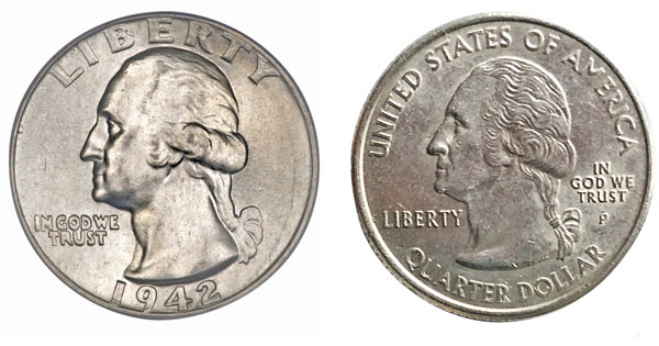
Reach into your pocket or purse and dig around for whatever change lingers there. For the purposes of this discussion, I hope you find at least one quarter minted before 1993 and another during the decade after 1999, the ones that have images of the states on the reverse side. (The newest “America the Beautiful” coins, minted since 2010, are a different matter, and I’ll discuss them later.) Look very carefully at both your coins, old and new, the George Washington side first. Linger on their differences, rolling each to see how the light catches their extremely low relief. Despite this negligible projection, the older one will feel like an embodied volume, a subtle form turning in space, the effect only increased by abrasion over time. The new one won’t have had time to wear down, but you can tell its future won’t be pretty. In fact, I propose it is upsettingly ugly and deformed and will always be so, and that our comparison of quarters has something to say about the direction our civilization is taking. It’s actually hard for me to even look at these newer quarters. I always try to get rid of them, to avoid having to look at them later. Friends who, like me, paint or sculpt tend to share this antipathy. So why such strong reactions?
Herbert Hoover commissioned John Flanagan to create a silver Washington quarter, which was first issued in 1932, during the depths of the Depression. From 1885 to 1890, Flanagan had worked as a studio assistant to our greatest sculptor, Augustus Saint-Gaudens, creator of, among other things, the monument to General Sherman in New York City and the memorial to Robert Gould Shaw on Boston Common. Flanagan’s apprenticeship served him well, to judge from the quality of his quarter. There’s true magic to his George Washington. Turn the coin on edge and there’s very little there, but we’re still wonderfully fooled into seeing a solid form in space: no easy task for the relief sculptor. Yes, it must be a likeness, but even more, we have to perceive the head swelling out toward us in a coherent way. Less than three-quarters of an inch from neck to pate and projecting out by perhaps a millimeter, he nevertheless looms large: that bulging head could house thoughts, the stern variety befitting any father of his country. Look at the coin as a tondo—that is, a circular work of art—then notice how comfortable Old George is in his round setting. The majestic crown of his head answers the curve above, with a diminuendo to his wig’s subsidiary bun, then down to the lovely little bow in his pigtail. The truncated shoulder echoes the circumference of the tondo, George’s organic form pressing against the coin’s edge, the proportions elegant. This tiny object is a jewel to be held lovingly in the hand.
Now look very carefully at New George; the one I am holding is from 2004. He resembles a fallen soufflé, his head a series of unrelated marks fighting each other with no sense of harmony. His features are all there, the famous nose, the diagonal neck muscle, as is his wig, now a collapsed mass of fussy and distracting linear squiggles. Still, he has no volume, no presence, certainly no potential psychology. I can sympathize with the artist’s plight, being told to cram in all those extra words (the new coins add “quarter dollar” and “United States of America” to “In God We Trust,” “Liberty,” and the year of issue), but that doesn’t excuse or explain this horrible head, this truly grotesque coin.
We are represented by these artifacts. We should cherish and be proud of them, even if soon we may be paying for everything by iPhone.
Now turn each coin over. Old George’s accompanying eagle is grand, its full chest logically placed in the center, its wings nicely echoing its curved cage. My new quarter happens to represent Florida, with a sailing ship, some palm trees, and the space shuttle all floating free of each other and of their circular home. There’s no effort to compose in response to the tondo, to think of the round space as by implication spherical, to make a gracefully or powerfully rhyming whole. Instead, the images fill their circle indifferently, with no poetry of call and response. They remind me of cheap carnival tokens, and when worn over time, they’ll be interchangeable with what we used to call slugs, plain metal disks used to fool the parking meter.
[adblock-right-01]
Many ancient Greek and Roman coins are tiny works of art, needing little explication or formal analysis. This isn’t about the height of the relief: many of these ancient coins would happily slide into that parking meter. The fully realized forms are right at home in their circular worlds, seeming to expand beyond their confines, or dance in circular motion. In one fourth-century BC Greek coin, a bull pushes eternally against the confines of his tondo: what invention! And in a fifth-century BC coin depicting two eagles killing a rabbit, the bodies of the birds animate the circle in yin-yang fashion, a dance in depth, the arching curve of the rabbit in death throes working against the encircling edge, a drama in small.
Return to the new quarter in your hand and compare it with a gold coin depicting an emperor from the seventh century AD. Each conveys information rather than pleasure, a sign for the state rather than an aesthetic experience. Both coins seem linear and fussy, unable to guide the eye in any thoughtful way. By the time we reach the profile of a king from an 11th-century AD coin, we’ve degenerated far from the beautiful coins of the Greek and Roman world. When I used to show students slides of Roman figurative sculpture, I would reverse their chronology. My students assumed I was illustrating a progression of increased skill and formal subtlety, starting with cinder-block primitivism and culminating in the astonishingly lifelike heads of Augustus or Agrippina. I’d hope that when told the sequence had been reversed, they would ask, in their lingo, WTF? The decline and fall of the Roman Empire was right there in front of them. What if something similar might now be happening without our even realizing it? Gibbon tells us that the empire was fractured by barbarian invasions but was also undermined by a new belief that this world was temporary and despicable, a tedious preface to eternal life with God. Today’s religious revival may be similarly millennial, but perhaps we’re trading the old, sensuously physical world for a virtual, digital substitute, a dream of elsewhere. We outsource our perceptions, asking our apps to apprehend. We settle for markers designed for quick reading but devoid of the richness of form that reminds us that we do exist in depth, in time, in a very real body.
Here I offer a note of hope. I spoke to some very helpful people at the U.S. Mint who mentioned that there had been some criticism of the new quarters, specifically about George’s “spaghetti hair,” though in my opinion such objections see the trees and miss the forest. According to the Mint’s website, his profile head was “restored to its original 1932 beauty,” which smacks of the New Coke debacle that led to Coca-Cola Classic. I hold a 2013 quarter, its George looking less deflated, if in perilously low relief—for apparently with new, harder materials, the die machines wear out too fast if George is more fleshed out. Though he’s a sufficient sign for barter, and good enough for government work, he still lacks all his old grandeur and presence. Technology may have trumped aesthetics.
Once, in Rome, an earnest academic, asked to give a five-minute summary of his project, droned on for 22 minutes about his study of Roman coins. With tremendous seriousness and the demeanor of Richard Nixon, he finished by insisting, “I am not, and I cannot stress this enough, i am not … [very long pause] … a numismatist.” This fact, I suspect, mattered more to him than to his audience, though I’ll assert the same thing, with a bit less humorless intensity: I am not a numismatist. But I like to think I’m sensitive to beautiful things, and that my distress about our new coins is more than pique or pickiness. It’s a sense that we are, perhaps unknowingly, making our civilization more callous, more disembodied, less about contemplation than instant gratification. Perhaps the little chunks of metal we carry in our pockets, soon to be replaced by newer versions or by chips embedded in our hands, could remind us of a choice between two approaches to life—if only we would pay attention.


