Flights of Fancy
The TWA Terminal at JFK, long dormant and then threatened with demolition, is reborn as a hotel

“TWA is beginning to look marvelous,” Eero Saarinen said, standing before the swooping concrete curves of his Trans World Airlines Terminal, then under construction at New York City’s Idlewild (now John F. Kennedy) Airport. “If anything happened and they had to stop work right now and just leave it in this state, I think it would make a beautiful ruin, like the Baths of Caracalla.”
The date was April 17, 1961. Five months later, Saarinen, the architect responsible for numerous mid-century landmarks—the St. Louis Gateway Arch, Bell Labs in New Jersey, the Ingalls Hockey Rink at Yale, the Miller House in Columbus, Indiana, and Dulles Airport, outside Washington, D.C.—was dead, at age 51, of complications from surgery to remove a brain tumor. TWA, as parting shots go, was a masterstroke, an idea as impractical in theory as it proved astonishing in execution. Saarinen had become convinced that architecture, with its prevailing adherence to the International Style of modernism (picture the sleek glass boxes of Mies van der Rohe), had barreled headlong into a dead end. TWA—organic, sculptural, evocative—represented an invigorating way forward. With its thin-shell roof and birdlike shape, the terminal captured the enchanting spirit of the early jet age, somehow managing to evoke, in the weighty guise of 5,000 tons of concrete, the feeling of movement and flight. Architecture critic Ada Louise Huxtable marveled at Saarinen’s sleight of hand in her review of Idlewild’s terminals in The New York Times:
The most dubious idea, which, paradoxically, has produced by far the best building, is Eero Saarinen’s magnificently detailed and exe-cuted tour de force for Trans World Airlines. … It is a subjective demonstration of sculptural form; a questionable approach superbly carried through to an exhilarating conclusion.
And yet, the terminal very nearly became the ruin that Saarinen had envisioned. After TWA declared bankruptcy for the final time, in 2001, the structure was mothballed, its future uncertain. “Can we tear it down?” That was the question that the Port Authority of New York and New Jersey, which manages the site, had posed to Richard Southwick, an architect at the New York–based firm Beyer Blinder Belle, when he had been hired as a consultant. “Yes, you can,” was his response, but given the furor sure to follow, “I wouldn’t want to be in your shoes.” After unsuccessful proposals by the likes of Donald Trump and hotelier André Balazs, New York–based MCR Development finally offered a workable plan, folding the historic structure into a complex featuring a hotel, conference center, and ballroom. Southwick and his firm served as the lead architects for the project. The bird has now been saved—the hotel opened on May 15—but has its soul been lost?
“In the air the consumer may be treated like a king. But on the ground he still has to fight his way through a chamber of horrors.” That’s how a critic described the state of air travel in 1956, which also happened to be the first year that more people crossed the Atlantic Ocean by plane than by ship. Saarinen aspired to turn that chamber of horrors into something efficient, graceful, uplifting. He traveled to the leading airports at the time—Chicago’s O’Hare, Pittsburgh, Philadelphia—and meticulously charted how long it took for planes to taxi, for passengers to check in, board, and disembark. In an interview with Metropolis magazine, Saarinen’s partner, Kevin Roche, who helped finish the TWA project after his death, recalled that “Eero went around with a stopwatch, measuring everything. This took four seconds more than last time. Of course, I was just waiting for the goddamn plane to take off so I could get a martini.”
Saarinen’s pioneering design featured a grand procession. Passengers checked in at street level, dispensing with their bags, then ascended a small succession of steps to the main level of the terminal. In a sunken lounge, which provided expansive views of the tarmac through floor-to-ceiling glass, or from a catwalk on the upper level, they could watch planes gliding into and returning from the heavens, priming them for their own adventures in the sky. When ready to board, they made their way through one of two tubes—dramatically lit, elevated passageways that connected the terminal to the flight wings, where the gates were located. If this was the golden age of flight, it was also perhaps the apex of American postwar optimism and might, and TWA seemed to embody that spirited race into the future.
Despite the romantic sentiment it inspired, Saarinen’s terminal was functionally obsolete almost from the beginning. The architect designed the terminal for propeller planes like the Lockheed Constellation, not jets such as the Boeing 707. By the early 1970s, the Boeing 747s, those hulking behemoths, had arrived and the gates were too closely spaced to efficiently handle their wide bodies, the terminal too small to accommodate the mass of humanity they transported. Over the years, the building was jerry-rigged with additional baggage-handling and security devices, but the lines sometimes extended out the door; Richard Southwick discovered photos of passengers who, because of overcrowding, were forced to sit inside the tubes as they waited for their flights. It was hardly the grand procession Saarinen had envisioned.
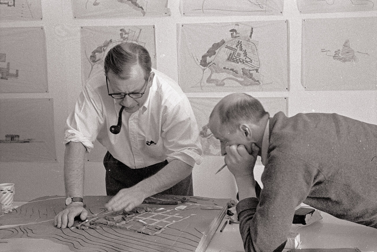
 Saarinen (left) and Kevin Roche in their Bloomfield Hills, Michigan, offices. Roche helped finish the TWA project after Saarinen’s death in 1961. (Library of Congress)
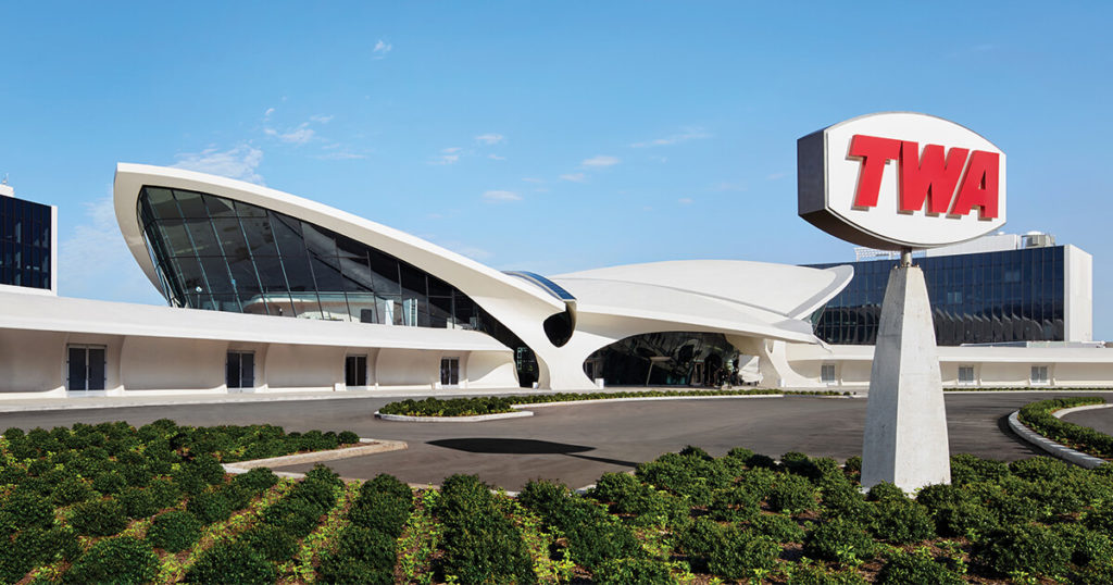
In the historic black-and-white photographs taken by Ezra Stoller in 1962, the year it opened, the terminal looms large and solitary on the landscape. But as I discovered when I toured the nearly finished project in late April, the structure, at least from the outside, appears surprisingly compact, like a scaled version of itself. It’s also now enclosed, like a precious jewel in a display case, by a mishmash of contemporary additions: a concrete parking garage, an elevated track for the AirTrain, and the two new six-story hotel wings that curve around Saarinen’s original building. The scope of those wings, containing 512 guest rooms—the number MCR calculated as necessary to make the project financially viable—was hotly contested by preservation groups, but by then the most significant damage to the setting had already been done, the flight center effectively caged.
In 2008, JetBlue Airways completed the construction of a new terminal adjacent to TWA, destroying the view of the tarmac from the landmark structure and demolishing its two flight wings. The cri de coeur from Philip Johnson, the controversial godfather of American architecture, went unheeded: “Imagine, tying a bird’s wings up. This will make the building invisible. If you’re going to strangle a building to death, you might as well tear it down.”
The Municipal Art Society, a New York–based preservation group, lobbied unsuccessfully to have the flight center folded into JetBlue’s plans—a proposal that may not have been functional but would have retained the building’s original use. (The terminal was listed on the National Register of Historic Places in 2004.) Frank Sanchis III, the former executive director at the Municipal Art Society and now the director of U.S. programs at the World Monuments Fund, remains livid more than a decade later. “The Port Authority failed to execute appropriate stewardship,” he told me. “They wound up with a masterpiece, and they didn’t do right by it.”
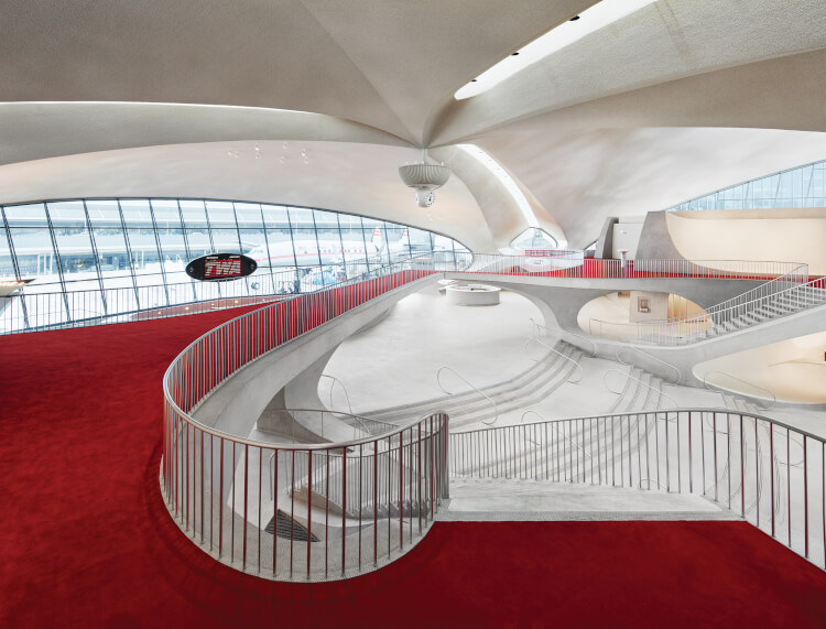
Still, as I discovered during my visit, Saarinen’s terminal maintains its sublime power. Although the former heart of the flight center was still very much a construction site, filled with workers, debris, and the clamor of power tools, its elevating vastness momentarily overwhelmed my senses. Light streamed through refurbished skylights; a newly fashioned Solari flip board, which once updated flight information, loomed above the sunken lounge, also refurbished; the restored Constellation Lounge awaited the fitting out of its red banquettes. The refashioned tubes now connect to the hotel wings as well as to the JetBlue terminal, inviting passengers to take a quick tour, maybe grab a bite at one of the redesigned restaurants, before hopping on their flights. All of the unsympathetic elements added over the years have now been stripped away.
Plane spotters and other aviation enthusiasts will like a great deal about the project. From the infinity pool on the south hotel building’s roof, drink-sipping patrons can follow the action on runway four (if they don’t mind the din or the smell of jet fuel wafting from below). Inside the “geek suite,” as Southwick calls it, a room in the same hotel wing, guests can get an intimate look at taxiing Airbus A380 widebodies, through five-inch-thick, triple-glazed windows. Just outside the sunken lounge, a 1958 Lockheed Constellation L-1649A (Connie for short) has been towed into place and restored as a cocktail lounge that can be accessed via an old-school ramp staircase, the plane’s exterior freshly painted and emblazoned with the TWA logo.
The project is awash in period details that aim to be more referential than derivative: Employees will sport newly designed TWA uniforms; Pentagram has refashioned the project’s original typeface; each hotel room features a red Saarinen-designed Womb Chair. Even the maple trees chosen for landscaping will have fall foliage that closely resembles TWA red. It remains to be seen whether the overall effect will be cloying, a midcentury stage set that, as the luster wears off and the carpets begin to fade and fray, will take on the forlorn air of a dated theme park.
 Among Saarinen’s aims was “to design a building in which the architecture itself would express the drama and specialness and excitement of travel.” (View from the London Club/TWA Hotel/David Mitchell)
Saarinen’s TWA terminal, animated from the start by a certain mystique, has always been as much about marketing, about image, as anything else. Consider the infamous grapefruit story: Aline Saarinen, Eero’s wife and publicist, described to a Time magazine reporter how the man himself, one morning at the breakfast table, had taken a grapefruit peel and, depressing his thumb into the middle, demonstrated his vision for the elliptical paraboloid shape of the terminal’s roof. This anecdote, clearly apocryphal, came to be celebrated as Saarinen’s moment of creative inspiration, not unlike how Aline peddled the idea of the building as a bird (Saarinen himself featured a flock of birds on the cover of his proposal to TWA), even as he publicly rejected the idea as somehow beneath his creative genius. It was all a bit of salesmanship, and TWA was more than happy to run with it, seizing on the image of the building as a branding tool.
What gained momentum with the likes of Saarinen, and reached a certain apotheosis in 1997 with Frank Gehry’s Guggenheim Museum in Bilbao, Spain, has only accelerated in our hypertrophied consumerist age, in which globetrotting architects design soulless baubles meant to be gawked at on Instagram. Not that Saarinen escaped this line of criticism in his day. In his 1969 book, American Architecture and Urbanism, Vincent Scully, the celebrated architectural historian, derided him for designing buildings intended for “dramatic unveiling at board meetings.” Huxtable, meanwhile, may have praised TWA’s form, but she recoiled from the consumerist bent of the terminals at Idlewild, including Saarinen’s: “One leveling factor equalizes them all: the indiscriminate overlay of uncontrolled defacing commercialism. The promise of the air age, which was bold and brilliant, has petered out into a world of petty vulgarity and perpetual Muzak.”
To the extent that there was a golden age of flight, it was but a moment, and it has long since passed us by. The project trades on a perfect past that never quite was. Yet Saarinen’s bird, even if it has been caged, still sings to us: conveying the hope and possibility of distant lands, the potential for far-flung adventure and for realizing a better version of ourselves. It’s an enduring monument to the power of an image, even if that image may be based on a sales pitch, a mirage.

